HyperWorks Desktop

Visualization Controls

Visualization Controls

Previous topic Next topic Expand/collapse all hidden text  

Visualization Controls

Previous topic Next topic JavaScript is required for expanding text JavaScript is required for the print function  

Use the Visualization controls to change many of the visual states in HyperMesh and HyperView. To access the Visualization controls, click visualization-24 on the Display toolbar. There are nine different types of visualization controls:

hmtoggle_plus1greyConnectors entityConnectors-16

Connector size - Specify a size (in model units) to display connectors in the graphics area.

Color by - Select a Color by scheme (State, Layer, Style, or Component) to change how connectors are color-coded in the graphics area. You cannot change the colors of each individual item within a scheme, but you can change what items display. Select or clear the check boxes next to each item to turn them on and off in the scheme.

VisOpts_Connectors

Colors are locked, but clearing an item's check box hides it in the graphics area.

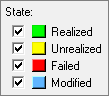
The Color by schemes and their corresponding color items include:

StateRealized, Unrealized, Failed, and Modified
Layer - < 2t, 2t, 3t, > 3t
StyleApply mass, area, bolt, seam, spot
Component – HyperMesh colors the Connectors based on the color of the component they exist in.


State/Layer/Style - HyperMesh only displays the connectors that match the selected check boxes in the graphics area. If you clear a check box, HyperMesh removes the connectors that match that criteria from the graphics area. You can use any combination of check boxes at a time.


Cylinder Bolts - change the display of cylinder bolts in the graphics area using the following controls:

Cylinder transparency - Move the slider to change the level of transparency of cylinder bolts in the graphics area.
Display status - Toggle the Display status on and off to show or hide cylinder bolts in the graphics area.


CWELDS – change the display of CWELD defined connectors in the graphics area by switching the CWELD visualization to on.

connector_visuatlization_cweld

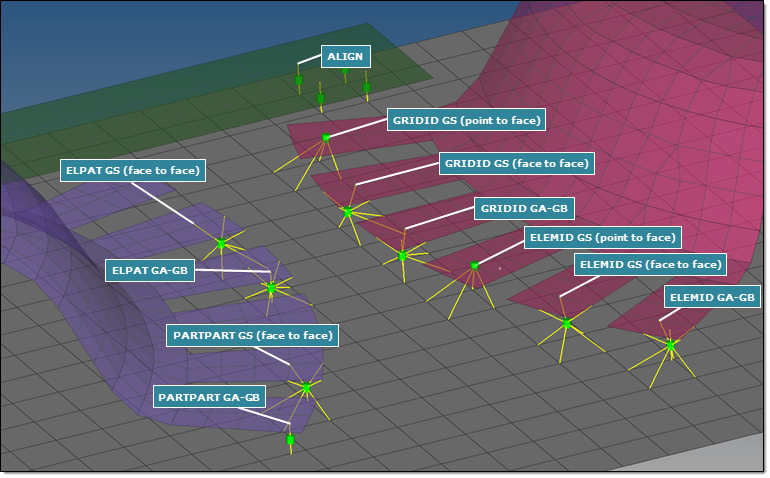
The graphical representation reflects the CWELD definition, and points directly from the connector to the referenced nodes, nodes of referenced elements, or referenced properties. The graphical representation is always shown in the appropriate CWELD component color.

Certain CWELD manipulations are not automatically synced. Editing the solver card or organizing the element into a new component requires you to reactivate the CWELD visualization.


hmtoggle_plus1greyConstraints entityLoadsConstraints-16

Constraint labels – Select this check box to display labels on constraint entities in the graphics area.

Relative constraint sizeSpecify how large, in model units, constraints are displayed relative to the model size.


hmtoggle_plus1greyEquations entityEquations-16

Equation Handles - Select this check box to display the handles on equations in the graphics area.


hmtoggle_plus1greyLoads entityLoads-16

Template labels (type) – Select this check box to display template-specific labels on loads in the graphics area. If you clear this check box, HyperMesh will display general HM labels on loads.

Load labels – Select this check box to display the labels of load entities (forces, moments, pressures, accelerations, velocities, temperatures, fluxes) in the graphics area.

Change load vector (tip/tail) at application point - Select this check box to point the load vector away from the load application point (tail) when the tip of the load vector is attached to the load application point. If you clear this check box, HyperMesh points the load vector toward the load application point (tip) when the tail of the load vector is attached to the load application point.

Note:The direction of the vector does not change when you select this option.

Load size – Specify a size (in model units) to display load entities in the graphics area. Use the toggle to select relative size or Uniform to control the size of load entities. Select Relative size to displays loads relative to the model size (default 100), or select Uniform to apply a constant size.


hmtoggle_plus1greyMorphing entityDomains-16

Handle size – Specify a size (in model units) to display morphing handles in the graphics area.

Symmetry size – Specify a size (in model units) to display morphing symmetries in the graphics area.

Colors – To change how morphing domains, faces, volumes and symmetries are color-coded in the graphics area, click the color boxes and select a new color from the color selector.

Morph volume edges, Edge points – Specify how many points each morph volume edge will use to represent curves in the graphics area. Use larger numbers for smoother curves and smaller numbers for faster rendering.

Morph volume faces - Use these options to choose how HyperMesh draws the flat faces of morph volumes in the graphics area:

Wireframe means that the face has no color at all; only the morph volume edges and handles are drawn.
Transparent (1, 2, or 3) means that the faces are drawn semi-opaque; higher numbers mean more opacity.
Opaque sets the morph volumes’ transparency to zero.


hmtoggle_plus1greySystems entitySystems-16

Relative system sizeSpecify how large, in model units, systems are displayed relative to the model size.


hmtoggle_plus1greyTags entityTags-16

Push tags to foreground - Select this check box to push all of the active tags to the foreground in the graphics area. If the entity the tag is attached to is visible in the graphics area, then HyperMesh will also display the tag. If the entity is not visible in the graphics area, then HyperMesh will hide the tag completely.

Tag text – From the Tag text list, select what type of text to display with the tags in the graphics area. You can choose from the following: only the Label, only the Body, both (Label:Body), or Description.

Tag icon – From the Tag icon list, select how to display the tag icons in the graphics area. You can choose from the following: Text Only, Text and Icon, or Icon Only.


hmtoggle_plus1greyTopology visopts_topology_button

Show line directions – Select this check box to display graphics on line entities in the graphics area to indicate the direction of the line.

Edges/Shaded faces on solids – Control the color-coding of the respective entities in the graphics area, and the display of those entities that match the selected criteria. The changes you make to the color options will only apply when used within the relevant geometry shading and color modes.

Solid transparency – Move the slider to change the level of transparency of the solid entities in the graphics area when they are used within the relevant geometry shading and color modes. The higher the number, the more transparent the solid entities appear.

Mappable solidsControl the color-coding of mappable solids when used with the relevant geometry shading and color modes.


hmtoggle_plus1greyVectors entityVectors-16

Vector Handles - Select this check box to display handles on vector entities in the graphics area.

Vector labels – Select this check box to display labels on vector entities in the graphics area.

Vector size – Specify a size (in model units) to display vector entities in the graphics area.  Use the toggle to select Vector size % or Uniform to control the size of vector entities. Select Vector size % to use a percentage of the actual length of the vector to determine the size, or select Uniform to apply a constant size.