In this tutorial, you will learn how to create bar charts by entering values, importing a data file, or specifying a mathematical expression.
Tools
When the plot type is set to Bar Charts ( ), the Define Curves panel allows you to add and edit bar charts in the active plot window. It can be accessed one of the following ways.
| • | Click on the Define Curves panel button  on the toolbar on the toolbar |
Or
| • | From the menu bar select Curves > Define Curves |
Bar charts are comprised of data and categories. Data can be entered as values, read from an external file, or defined as a mathematical expression.
Exercise: Create Bar Charts
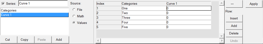
Step 1: Create a bar chart by entering values in the Define Curves panel.
Enter the values 563.35, 567.22, and 423.51.
| 1. | From the menu bar select File > New > Session to clear the contents of the current session. |
| 2. | From the plot type menu, select Bar Chart, . |
| 3. | Enter the Define Curves panel, . |
| 4. | Click Add to create a new bar chart named Curve 1. |
Curve 1 is highlighted in the series list to indicate it is the active series.
| 5. | In the Series field above the bar chart list, rename Curve 1 to Nodal Point 1 and press ENTER. |
| 6. | Under Source, select Values. |
| 7. | In the panel’s center, under the column Nodal Point 1, type these three values: |
Index 1:
|
563.35
|
Index 2:
|
567.22
|
Index 3:
|
423.51
|
| 8. | Click Apply to create the bar chart. |
Step 2: Create a bar chart by importing values from the data file nodal_values.dat.
| 1. | Add a second bar chart to the current plot window. |
| 2. | Rename Curve 2 to Nodal Point 2. |
| 3. | Under Source, select File. |
| 4. | Click the file browser next to File: and open the nodal_values.dat file, located in the plotting folder. |
| 5. | Leave Type: set to Unknown. |
| 6. | Leave Request: set to Block1. |
| 7. | Leave Component: set to Column1. |
| 8. | Click Apply to create the bar chart. |
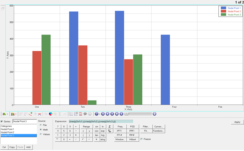
Step 3: Create a bar chart using a math expression.
| 1. | From menu bar, select File > Import > Session and open the session file bar_chart.mvw, located in the plotting folder. |
A second page containing an XY Plot window with three XY data curves is added to the session and is currently displayed.
| 2. | Go back to the session’s page 1, which contains the bar chart. |
| 3. | Add a third bar chart to the current plot window. |
| 4. | Rename Curve 3 to Nodal Point 3. |
| 5. | Under Source, select Math. |
| 6. | In the Expression: field, type the following math expression: {max(p2w1c1.y),max(p2w1c2.y),max(p2w1c3.y)} |
| 7. | Click Apply to create the bar chart. |
Step 4: Modify category labels.
| 1. | In the Categories column, click One, rename it x disp, and click Apply to update the bar chart’s label. |
| 2. | Rename category Two to y disp. |
| 3. | Rename category Three to z disp. |
| 4. | Click Apply to update the bar chart’s labels. |
Go to HyperGraph 2D Tutorials


