Assigning Properties to Selected Controls |

|

|

|

|
|
Assigning Properties to Selected Controls |

|

|

|

|
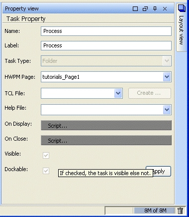
The Property view tab allows you to assign specific properties to the selected HWPM control. Every control exposes properties that can be modified from the Property view panel. For example, the text on a label is a property exposed by the Label control. Typical properties also include font, color, visible, enable, and so on.

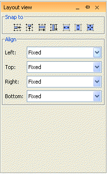
Once properties have been assigned to a control, you can design GUI layout in a page using the Layout tab. The Layout tab allows you to position individual controls on the page and determine how the page will be displayed to the end-user.

There are several options for positioning controls with respect to complete page layout, including the following:
Layout Option |
Description |
Fixed |
Distance from left edge of page is constant. |
Relative |
Relative distance between the widgets present in a page. Controls adjust (resize relative to the page resize. For example, if a control is placed with "right" as Relative the page automatically places a scroll-bar as it is preserving the relative position to the page. |
Free |
No restrictions. |
Anchor |
Sets the position of the control with respect to the right border of the page. |
Basic positioning controls:
Icon |
Action |
|
Snap control to closest grid line on the left. |
|
Snap control to closest grid line on the top. |
|
Snap control to closest grid line on the right. |
|
Snap control to closest grid line on the bottom. |
|
Snap control to closest grid lines on the left and right. |
|
Snap control to closest grid lines on the top and bottom. |
|
Align all sides to closest grid lines. |