hwtk::button |

|

|

|

|
|
hwtk::button |

|

|

|

|
hwtk::button - Widget that issues a command when pressed
A hwtk::button widget displays a textual label and/or image, and evaluates a command when pressed.

![digraph HWButton { layout = "dot"; rankdir = LR; ratio = "compress"; edge [color="#333333"] node [shape=rect, style="rounded,filled", fontname="sans-serif, serif", color="#000000", fillcolor="#FCFFF6", penwidth=0.5]; Archetype [label="Archetype", fillcolor="#FFF5FF", tooltip="::itk::Archetype", URL="../_auto/architecture.html"]; HWIBase [label="HWIBase", fillcolor="#E0FFFF", tooltip="::hwtk::interface::HWIBase", ]; HWIWidget [label="HWIWidget", fillcolor="#E0FFFF", tooltip="::hwtk::interface::HWIWidget", ]; HWIButton [label="HWIButton", fillcolor="#E0FFFF", tooltip="::hwtk::interface::HWIButton", ]; HWButton [label="HWButton", fillcolor="#FFEAD8", tooltip="::hwtk::widget::HWButton", URL="button.html"]; Archetype -> HWIBase; HWIBase -> HWIWidget; HWIWidget -> HWIButton; HWIButton -> HWButton; } digraph HWButton { layout = "dot"; rankdir = LR; ratio = "compress"; edge [color="#333333"] node [shape=rect, style="rounded,filled", fontname="sans-serif, serif", color="#000000", fillcolor="#FCFFF6", penwidth=0.5]; Archetype [label="Archetype", fillcolor="#FFF5FF", tooltip="::itk::Archetype", URL="../_auto/architecture.html"]; HWIBase [label="HWIBase", fillcolor="#E0FFFF", tooltip="::hwtk::interface::HWIBase", ]; HWIWidget [label="HWIWidget", fillcolor="#E0FFFF", tooltip="::hwtk::interface::HWIWidget", ]; HWIButton [label="HWIButton", fillcolor="#E0FFFF", tooltip="::hwtk::interface::HWIButton", ]; HWButton [label="HWButton", fillcolor="#FFEAD8", tooltip="::hwtk::widget::HWButton", URL="button.html"]; Archetype -> HWIBase; HWIBase -> HWIWidget; HWIWidget -> HWIButton; HWIButton -> HWButton; }](graphviz-095e586f64aad79a9598d1456d6da3bd36b378a6.png)
hwtk::button - pathName ?option value? ...
-clientdata, clientData, ClientData
-helpcommand, helpcommand, Command
-textvariable, textVariable, Variable
-underline, underline, Underline
Command-Line Name: -command
Database Name: command
Database Class: Command
A script to evaluate when the widget is invoked.
Command-Line Name: -default
Database Name: default
Database Class: Default
May be set to one of normal, active or disabled. In a dialog box, one button may be designated the default button (meaning, roughly, the one that gets invoked when the user presses <Enter>). active indicates that this is currently the default button; normal means that it may become the default button, and disabled means that it is not defaultable. The default is normal. Depending on the theme, the default button may be displayed with an extra highlight ring, or with a different border color.
In addition to the standard configure, cget, identify, instate, and state commands, button support the following additional widget commands:
pathName invoke
Invokes the command associated with the button.
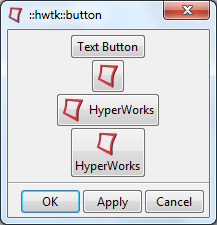
::hwtk::dialog .d -title "::hwtk::button"
set f [.d recess]
hwtk::button $f.b1 -text "Text Button" -help "Text only"
hwtk::button $f.b2 -image productHyperWorks-24.png -help "Image only"
hwtk::button $f.b3 -text "HyperWorks" -image productHyperWorks-24.png -compound left -help "Image and text compound left"
hwtk::button $f.b4 -text "HyperWorks" -image productHyperWorks-24.png -compound top -help "Image and text compound top"
pack $f.b1 $f.b2 $f.b3 $f.b4
.d post