hwtk::checkbutton |

|

|

|

|
|
hwtk::checkbutton |

|

|

|

|
hwtk::checkbutton - On/off widget
A hwtk::checkbutton widget is used to show or change a setting. It has two states, selected and deselected. The state of the checkbutton may be linked to a Tcl variable.

![digraph HWCheckbutton { layout = "dot"; rankdir = LR; ratio = "compress"; edge [color="#333333"] node [shape=rect, style="rounded,filled", fontname="sans-serif, serif", color="#000000", fillcolor="#FCFFF6", penwidth=0.5]; Archetype [label="Archetype", fillcolor="#FFF5FF", tooltip="::itk::Archetype", URL="../_auto/architecture.html"]; HWIBase [label="HWIBase", fillcolor="#E0FFFF", tooltip="::hwtk::interface::HWIBase", ]; HWIWidget [label="HWIWidget", fillcolor="#E0FFFF", tooltip="::hwtk::interface::HWIWidget", ]; HWIButton [label="HWIButton", fillcolor="#E0FFFF", tooltip="::hwtk::interface::HWIButton", ]; HWCheckbutton [label="HWCheckbutton", fillcolor="#FFEAD8", tooltip="::hwtk::widget::HWCheckbutton", URL="checkbutton.html"]; Archetype -> HWIBase; HWIBase -> HWIWidget; HWIWidget -> HWIButton; HWIButton -> HWCheckbutton; } digraph HWCheckbutton { layout = "dot"; rankdir = LR; ratio = "compress"; edge [color="#333333"] node [shape=rect, style="rounded,filled", fontname="sans-serif, serif", color="#000000", fillcolor="#FCFFF6", penwidth=0.5]; Archetype [label="Archetype", fillcolor="#FFF5FF", tooltip="::itk::Archetype", URL="../_auto/architecture.html"]; HWIBase [label="HWIBase", fillcolor="#E0FFFF", tooltip="::hwtk::interface::HWIBase", ]; HWIWidget [label="HWIWidget", fillcolor="#E0FFFF", tooltip="::hwtk::interface::HWIWidget", ]; HWIButton [label="HWIButton", fillcolor="#E0FFFF", tooltip="::hwtk::interface::HWIButton", ]; HWCheckbutton [label="HWCheckbutton", fillcolor="#FFEAD8", tooltip="::hwtk::widget::HWCheckbutton", URL="checkbutton.html"]; Archetype -> HWIBase; HWIBase -> HWIWidget; HWIWidget -> HWIButton; HWIButton -> HWCheckbutton; }](graphviz-57fe693284b3e6b6a85d2af26a04ee5cb5e7ef58.png)
hwtk::checkbutton - pathName ?option value? ...
-clientdata, clientData, ClientData
-helpcommand, helpcommand, Command
-textvariable, textVariable, Variable
-underline, underline, Underline
Command-Line Name: -command
Database Name: command
Database Class: Command
A script to evaluate when the widget is invoked.
Command-Line Name: -offvalue
Database Name: offValue
Database Class: OffValue
The value to store in the associated -variable when the widget is deselected. Defaults to 0.
Command-Line Name: -onvalue
Database Name: onValue
Database Class: OnValue
The value to store in the associated -variable when the widget is selected. Defaults to 1.
Command-Line Name: -variable
Database Name: variable
Database Class: Variable
The name of a global variable whose value is linked to the widget. Defaults to the widget pathname if not specified.
In addition to the standard configure, cget, identify, instate, and state commands, checkbutton support the following additional widget commands:
pathName invoke
Toggles between the selected and deselected states and evaluates the associated -command. If the widget is currently selected, sets the -variable to the -offvalue and deselects the widget; otherwise, sets the -variable to the -onvalue. Returns the result of the -command.
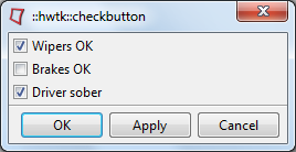
::hwtk::dialog .d -title "::hwtk::checkbutton"
set f [.d recess]
array set state {wipers 1 brakes 0 driver 1}
hwtk::checkbutton $f.ck1 -text "Wipers OK" -help "Select safety item - wipers" -variable state(wipers)
hwtk::checkbutton $f.ck2 -text "Brakes OK" -help "Select safety item - brakes" -variable state(brakes)
hwtk::checkbutton $f.ck3 -text "Driver sober" -help "Select safety item - driver state" -variable state(driver)
grid $f.ck1 -sticky w
grid $f.ck2 -sticky w
grid $f.ck3 -sticky w
.d post