Card Image Subpanel |

|

|

|

|
|
Card Image Subpanel |

|

|

|

|
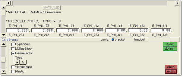
Use the card image subpanel to edit solver specific data on a set of entities.
The card image subpanel is divided into two parts, the card image and the options. The top portion of the menu contains the card image. If the image is too large to display, scrollbars are added. The increase and decrease buttons can be used to move one line or character at a time, or the position indicator inside the scrollbar can be selected and moved. The position of the scrollbar is not updated until the mouse button is released.
Each line of data in the card is displayed as two lines on the card image subpanel. The header line on top displays the name of the field, while the data line below displays the data for that field.

There are several menu items used exclusively by the card image subpanel.
Data headers are used to show a field's name and width in the card for non-solver-specific data.

Restricted input fields function the same as other input fields, except when a value is entered that is outside of a specified range, the input text is displayed in red and an error message is displayed with the acceptable values. You can enter a value that is outside of the specified range, but it may cause errors or problems for the solver.

Entered value is outside the specified range.

Entered value is within the specified range.
When a card references another entity, a collector is shown on the header line with the ID of the current entity that is in that collector on the data line. An ID of 0 (zero) indicates that the collector is currently empty. You can place entities in the collector by selecting them graphically while the collector is active, or selecting the collector while it is active and using the extended entity selection menu.
![]()
This appears as a button with a title on it. When the button is clicked, a pop-up with the available options is displayed. If an option is chosen, the text of the button changes to match the selected option.
![]()
The title is drawn either with or without brackets, depending on the status of the data that it corresponds to. Bracketed titles indicate a default value, while non-bracketed titles indicate a user-specified value.
![]()
Default value (title bracketed).
![]()
User value (no brackets).
The option tree is drawn on the bottom portion of the menu, to the left of the action buttons, and lists properties that can be added to the card. Clicking a checkbox expands the corresponding item and adds new fields to the card image, which can then be edited. Each field has a corresponding item in the option tree that displays as a sub-set of the checked item.

Option tree
There are two basic types of options that can appear in the tree:
| 1. | Click |
| 2. | An input field that accepts a keyboard entry. For example, a property with multiple beam sections might have an option that you can use to enter how many beam sections were needed, then fill in that data in the card image. |
If an option is dependent on a previous option, a vertical line is drawn down from the controlling option, which branches to all the dependent options. The scrollbars can be used to maneuver up and down the tree.
When multiple entities are selected, the card image may not be able to show a value for every field. When the fields have differing values, an X is displayed. If the field is user-editable, you can select the item and change its value, and apply this change to every entity from which the card image was constructed.

Field with differing values