|
LS-DYNA Component Table |

|

|

|

|
|
|
LS-DYNA Component Table |

|

|

|

|
LS-DYNA Component Table
The LS-DYNA Component Table is an interactive tabular list used to represent LS-DYNA components with associated properties and materials. It is accessed by loading the LS-DYNA user profile and clicking the Component Table button on the LS-DYNA Utility Menu.

The table contains a variety of tools that allow you to review, edit, and update the model. The essential features are:
| • | LS-DYNA components with various associated properties and materials are listed in separate columns. |
| • | You can select the column types from a set of available options. |
| • | There are two modes of operation: review and editable. Use the review mode to review the component information without changing any values. Use the editable mode to change values for the selected components. |
| • | There are enhanced selection, review, display, and filter options for components. |
| • | Components can be sorted according to any available column. |
| • | The current configuration is saved automatically to a file at the end of a session and recalled on reload. You can also save and load a configuration file. |
| • | The table data can be export in CSV and HTML formats. |
| • | Right click on the table to display menu options. All pull-down menu options are also available using a right click. |
| • | Columns can be moved or swapped by holding the left mouse button on a column title and dragging it to the desired location. |
| • | Columns can be resized by positioning the cursor along a column border, pressing the left or right mouse button, and dragging the border to a new position. |
| • | The shift or ctrl key combined with a left click can be used to select multiple rows. |
The following tools are available in the LS-DYNA Component Table:
Refresh |
Regenerates the table with all the parts in the model |
Sets the table mode to editable mode, allowing you to change values for the selected components |
|
Enables the filtering GUI |
|
Specify the number and type of columns listed in the table |
|
Save |
Saves the information listed in the table in CSV or HTML format |
Quit |
Quit the table function. |
All |
Selects all rows or parts |
None |
Selects none or deselects parts/rows that were previously selected |
Reverse |
Reverses the selection |
Displayed |
Selects the rows or the displayed parts |
User |
User graphic interaction to select parts |
By default, the table is invoked with only the displayed parts. You can refresh the table to show a new part being displayed or use one of the following display commands.
All |
Displays all the components in the model |
None |
Turns off every component displayed |
Reverse |
Reverses the display of the part |
Show selection |
Displays the components of the selected rows |
Show only Selection |
Displays only the components of the selected rows |
Hide selection |
Hides the components of the selected rows from the display |
By Material |
Displays components sorted by material |
By Properties |
Displays components sorted by properties |
By Thickness |
Displays components sorted by thickness values |
Delete Selection |
Deletes selected rows (parts) from the model |
Set MatDB Path… |
Opens a dialog on which you can set the location of an external database of material definitions. |
Refresh Material List |
Updates the list of available materials in the Component Table. |
When the Component Table is in editable mode, you can change values for all selected components at the same time. Select the Table > Editable option to open the Component Table in editable mode. Cells with a white background can be manually edited. When you click on an editable cell, it is selected with a cursor. Once a cell is selected, enter a value and press Enter.
If you want to assign the same value to multiple components at once, select the column type and value from the Assign Values menu and click Set. All the selected components will be updated with the assigned values.
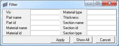
The Component Table supports advanced filtering based on available columns. The Table > Filter menu option opens the Filter dialog as shown below.

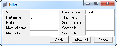
You can write any valid string with a wildcard (*) in any of the available column types and click Apply to filter the table. For example, if you want to show all components that start with letter ‘c’ and use material ‘steel’, you can use the dialog as shown below.
|

Show All turns off the filtering and displays all the components. Select the Table > Configure > Filter on top option to keep the Filter dialog posted after clicking Apply or Show All. Otherwise, it closes.
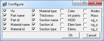
Column types can be selected from the Table > Configure > Columns menu option. The table displays only the selected columns. The available columns types are:
Vis |
Visualization status. 1 = display on, 0 = display off |
Part name |
HyperMesh name of the component (maximum 32 characters) |
Part id |
HyperMesh ID of the component |
Material name |
Material name associated with the component |
Material id |
Material ID associated with the component |
Material type |
Material type associated with the component |
Thickness |
Thickness of elements specified in *section_shell |
Section name |
*Section name associated with the component |
Section id |
*Section ID associated with the component |
Section type |
Type of the *Section associated with the component |
Color |
Component color |
Int points |
Number of integration points specified for the *Section_shell |
HGID |
Hourglass ID associated with component |
Elem form |
Element formulation for the *section of the component |
Elems |
Number of elements in the component |
Nodes |
Number of nodes in the component |
Mass |
Total mass of the component |
cg_x |
Center of gravity for the x coordinate |
cg_y |
Center of gravity for the y coordinate |
cg_z |
Center of gravity for the z coordinate |

The Component Table lists components in two modes: All or Displayed. If All is selected from the Table > Configure > Components menu, the table will list all the components in the model. If Displayed is selected, only the visible components will be shown. Blank components are not shown in the Displayed mode even though their display status is on.