HyperView User's Guide

Entity Editor

Entity Editor

Previous topic Next topic Expand/collapse all hidden text  

Entity Editor

Previous topic Next topic JavaScript is required for expanding text JavaScript is required for the print function  

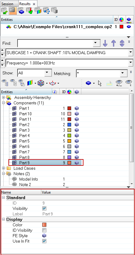
The Entity Editor section of the Results browser allows you to view and edit various entity conditions/properties.  Click on an entity in the upper portion of the browser to automatically display the properties assigned to that entity in the Entity Editor (located in the lower half of the browser). The Model view must be active within the Results browser in order to access the Entity Editor.

entity_editor_browser_example_hv

The Entity Editor is turned on and displayed in the browser by default; however you can hide the editor by clicking on the show/hide toggle entity_editor_arrow_icon_hv (located in the top right corner).  In addition, the Entity Editor can be resized vertically and horizontally by clicking on the line that separates the editor from the browser or graphics area (note the double arrow) and dragging and releasing the mouse button once the desired height or width is reached.

The entity categories/properties that are displayed under the Name and Value headers will vary, depending upon the type of entity that is selected.  Click on each supported entity (below) to view a list of properties that are available for editing:

hmtoggle_plus1greyComponents/Parts

entity_editor_component_hv

Category

Property

Description

Standard


ID

The ID of the component/part.

*This field is not editable.


Visibility

Activate/deactivate the check box to turn the display of the component/part on/off in the graphics area.


Label

The label of the component/part.

*This field is not editable.

Display


Color

Click the Color box to select a component/part color from the pop-up dialog.


ID Visibility

Activate/deactivate the display of the component/part ID using the check box.


FE Style

Select/change the element visualization mode of the component/part.  The following options are available:

Wireframe Elements visualizationElementsWireframe-24
Transparent Elements visualizationElementsTransparent-24
Shaded Elements and Mesh Lines visualizationElementsShadedWithMesh-24
Shaded Elements and Feature Lines visualizationElementsShadedWithFeatures-24
Shaded Elements visualizationElementsShaded-24


Use in fit

Activate the check box to scale the graphic to fit the window with respect to the selected entities in the animation.

hmtoggle_plus1greyMeasures

entity_editor_measure_hv

Category

Property

Description

Standard


ID

The ID of the measure group.

*This field is not editable.


Visibility

Activate/deactivate the check box to turn the display of the measure group on/off in the graphics area.


Label

Click in the field to change the label of the measure group.


Type

Select a measure type using the drop-down menu:

Distance Between
Incremental Distance
Minimum Distance
Position
Relative Displacement
Relative Angle
Angle Between
Incremental Angle
Circle Radius
Yaw Pitch Roll
Elemental Contour


Pick

Select/change the type of entity that will be added to a measure group using the input collector. You can also left click the collector to display the Select by ID dialog.

Note - For Minimum Distance measure groups, clicking in the field will display the Minimum Distance dialog.  Use the input collectors to select From and To entities.


Items

Display the Measure Items dialog.  Click Delete to remove the selected items from the Measure Items list, or click Create Curves to display the Create Curves dialog.  This dialog will remain active until it is closed.

Note - For Minimum Distance measure groups only, the Review mode button measure_panel_min_distance_review_icon_hv and the Edit button measure_panel_min_distance_edit_icon_hv will also be displayed in the Measure Items dialog.

Display


Font

Display the Font Selector dialog.  This dialog allows you to select the font type, font style, and font size.


Color

Select a measure color.


ID Visibility

Display the measure group ID.


Name

Display the measure group.


System

Display the system ID.


Magnitude

Display the magnitude value for the selected measure group.


X

Display the X value for the selected measure group.


Y

Display the Y value for the selected measure group.


Z

Display the Z value for the selected measure group.


True angle

Display the projected true angle onto the plane.

*Applicable only for a angle type measures (Relative Angle, Angle Between, and Incremental Angle).


x-proj

Display the projected true angle onto the plane, with the x-axis as the normal.

*Applicable only for a angle type measures (Relative Angle, Angle Between, and Incremental Angle).


y-proj

Display the projected true angle onto the plane, with the y-axis as the normal.

*Applicable only for a angle type measures (Relative Angle, Angle Between, and Incremental Angle).


z-proj

Display the projected true angle onto the plane, with the z-axis as the normal.

*Applicable only for a angle type measures (Relative Angle, Angle Between, and Incremental Angle).


Radius

Display the radius of the circle for the selected measure group.

*Applicable only for a Circle Radius measure.


Ctr X

Display the X-coordinate of the center of the circle for the selected measure group.

*Applicable only for a Circle Radius measure.


Ctr Y

Display the Y-coordinate of the center of the circle for the selected measure group.

*Applicable only for a Circle Radius measure.


Ctr Z

Display the Z-coordinate of the center of the circle for the selected measure group.

*Applicable only for a Circle Radius measure.

Advanced


Tracking

Change the resolved in system to a tracking system.


Resolved in

Select a system using the input collector.  You can also hold down Shift and left click the collector to display the Select by ID dialog.

Global


Transparency

Activate/deactivate the transparency mode.


Auto hide

Hide the measure group box when the selected entities are not visible on the screen.


Format

Select the Fixed or Scientific format from the drop-down menu.


Precision

Increase or decrease the precision level using the up/down arrows.


Angle

Select Degrees or Radians for the angle using the drop-down menu.

hmtoggle_plus1greyNotes

entity_editor_note_hv

Category

Property

Description

Standard


ID

The ID of the note.

*This field is not editable.


Visibility

Turn the display of the note on/off in the graphics area.


Label

Click in the field to change the label of the note.


Text

Display the Note Text dialog.  You can update the note text in the Description box by entering text directly, or by selecting a field name clicking Insert Field. You can also enter a Templex expression directly into the Description box.


Position

Allows you to change the position of the note.


Attach Type

Select the anchoring method for note using the drop-down menu:

Window (*Default)
Entity
Coordinates

Once attached, notes can be positioned anywhere in the window.

Display


Font

Display the Font Selector dialog.  This dialog allows you to select the font type, font style, and font size.


Color

Select a note color.


Align Text

Select the text alignment (within the note box) from the drop-down menu:

Left
Center
Right


Fill color

Select a fill color for the note box. You must remove the check mark from the Fill Transparency option in order to select a fill color.


Fill Transparency

Remove the color from the note box and make it transparent against the window.


Border Color

Select a border color.


Border Thickness

Select the border line thickness for the note box from the drop-down menu:

0 (no border)
1
2
3
4


Shape

Select the outline shape of the note:

Rectangle
Circle
Ellipse

Note: This is option is only available only in the Entity Editor (it is not available in the Notes panel).

Advanced


Move to Entity

Position the note at the attachment location.

Note:  This option is disabled if Window has been selected from the Attach To drop-down menu.

Activating the Move to entity check box will automatically override the Anchor to Screen option (if activated).


Auto Hide

Hide the note box when the entity that the note is attached to is not visible on the screen.


Screen Anchor

Keep the note stationary during animation or when manipulating the model view (rotating, zooming, etc.).

Note:  This option is disabled if Window has been selected from the Attach To drop-down menu.

hmtoggle_plus1greyProperties

Current Entity Editor support for Properties is limited to viewing only.

entity_editor_properties_hv

Category

Property

Description

Standard


ID

The ID of the property.

*This field is not editable.


Label

The label of the property.

*This field is not editable.

hmtoggle_plus1greySection Cuts

entity_editor_section_cut_hv

Category

Property

Description

Standard


ID

The ID of the section cut.

*This field is not editable.


Type

The section cut type (Planar or Spherical).

*This field is not editable.


Visibility

Turn the display of the section cut on/off in the graphics area.


Label

Click in the field to change the label of the section cut.


Orientation

Click to display the Section Plane dialog, which allows you to change/define the plane of the section cut.


Base

Specifies the x, y, and z coordinates of the base point of the section cut plane.


Normal

Specifies the direction cosines of the normal of the section cut plane.

Display


Cross Section Only

Display a cross section of the section cut.


Clip Above

When activated, the portion of the model along the positive side of the section plane’s normal will be clipped.


Deformable

Allow the section cut to be deformed, along with the components, during animation.

When this option is selected, a time step/frame number is added next to the section cut label in the Results browser and in the Section Cut panel.


Cross Section Width

Adjust the width of the cross section using the slider bar. The Cross Section Only check box (see above) must be activated in order for the slider bar to be displayed.


Clip Elements

Display the elements of the clipped part of the model.


Show Section Color

Change the section cut color.


Section Color

Select a color from the palette. The Show Section Color check box (see above) must be activated in order for the selected color to be displayed.


Grid

Display the grid lines in the graphics area.


Grid Text

Display the grid line text in the graphics area.


Grid Text Precision

Select the precision to be used for the grid line text value using the combo box.


Grid Line Space X

Change the spacing of the grid lines along the section plane's x direction.


Grid Line Space Y

Change the spacing of the grid lines along the section plane's y direction.

Global


Feature Lines

Display the feature lines of the clipped part of the model.


Transparency

Display the clipped part of the model as a transparent surface.

entity_editor_section_cut_spherical_hv

Category

Property

Description

Standard


ID

The ID of the section cut.

*This field is not editable.


Type

The section cut type (Planar or Spherical).

*This field is not editable.


Visibility

Turn the display of the section cut on/off in the graphics area.


Label

Click in the field to change the label of the section cut.


Center Node

Click to display the Node collector, which allows you to adjust the position of the base point of the section cut to the center node.


Center

Specifies the x, y, and z coordinates of the base point of the section cut.  Click in the field to manually enter in coordinates if desired.


Radius

Specifies the radius of the spherical section cut.  Click in the field to manually adjust the radius of the sphere.

Display


Cross Section Only

Display a cross section of the section cut.


Clip Inside

Displays the cross section of the section cut inside the sphere when unchecked.


Sphere

Displays a sphere.


Deformable

Allow the section cut to be deformed, along with the components, during animation.

When this option is selected, a time step/frame number is added next to the section cut label in the Results browser.


Show Section Color

Change the section cut color.


Section Color

Select a color from the palette. The Show Section Color check box (see above) must be activated in order for the selected color to be displayed.


Clip elements

Display the elements of the clipped part of the model.

Global Elements


Feature Lines

Display the feature lines of the clipped part of the model.


Transparency

Display the clipped part of the model as a transparent surface.

Note - Spherical section cuts are not displayed in the Section Cuts list in the Section Cut panel.

You can use the browser context menu to complete a variety of tasks such as; creating a new planar or spherical section cut, editing existing section cuts (planar only), renaming or deleting existing section cuts, , etc.

Whenever a section cut is selected in the Results browser, the manipulator will be active and ready to be edited.

hmtoggle_plus1greySets

entity_editor_sets_hv

Category

Property

Description

Standard


ID

The ID of the set.

*This field is not editable.


Visibility

Turn the display of the set on/off in the graphics area.


Label

Click in the field to change the label of the set.


Entity IDs

Lists the number of entities in the active set.  Click in the field to activate the input collector, which allows you to select/change the entity type of a set.  You can also hold down Shift and left click the collector to display the Extended Entity Selection dialog.

Display


Color

Select/change the color of the feature lines of the entities in a set using the color box and palette.


ID Visibility

Display the IDs of entities in a set/group.


Draw Style

Select the drawing style for the active set using the input collector:

shaded (for Component sets only)
wire (for Component or Element sets only)
point (for Node sets only)
sphere (for Node sets only)


Draw Size

Change the thickness of the wire and the size of the point/sphere drawing for the active set.

hmtoggle_plus1greyViews

Orthographic and Perspective are traditional HyperView view modes, while the Lens type simulates a camera lens (and can be used if you have the camera angle coordinates).  These various modes will apply the view volume/clipping region differently.

Current View is a view which is always synchronized with the graphics window. It cannot be deleted or locked.  All other user defined or image plane alignment generated views, are locked by default.  You can however, “unlock” those views and modify them.  When a view is unlocked, it is also synchronized with the graphics window.

entity_editor_orthographic_view_hv

Category

Property

Description

Standard


Label

The ID of the view.

*This field is not editable for Current View.

View Projection


Projection Type

Select/change the projection type of the view (Orthographic, Perspective, or Lens).

Orthographic is the default projection type, and is useful for orienting media that are primarily captured in near orthogonal views (Top, Left, Front, Bottom, Right, and Rear).

entity_editor_perspective_view_hv

Category

Property

Description

Standard


Label

The ID of the view.

*This field is not editable for Current View.

View Projection


Projection Type

Select/change the projection type of the view (Orthographic, Perspective, or Lens).

Perspective allows you to display graphics using true 3D perspective.

Note - The Perspective option on the Display Control menu on the toolbar visualization-24 can also be used used to control the 3D graphics display.


Perspective Angle

Click in the field and use the slider bar to adjust and set the angle of the perspective (from 5 to 45 degrees).


entity_editor_lens_view_hv

entity_editor_lens_view_example_hventity_editor_lens_view_example2_hv

Example of a camera and model                                        Example of a camera

Category

Property

Description

Standard


Label

The ID of the view.

*This field is not editable for Current View.


Lock

Activate to lock the view.

Camera


See the example images above.


Target

The coordinates of the point on the 3D model where the camera is focused on.  There is no default value, a user defined value should always be provided.


Position

The coordinates of where the camera is in 3D model space.  There is no default value, a user defined value should always be provided.


Orientation Method

Define which direction the top of the camera is pointing towards:

X-up
X-down
Y-up
Y-down
Z-up
Z-down
Vector (Default)


Orientation Vector

When an orientation method is chosen as any predefined method (XYZ axis and up or down), the orientation vector is automatically assigned with corresponding vectors.  The default value is 0.33, 0.33, 0.33.  When the orientation method is set to Vector, you can arbitrarily input a vector.  This vector is an approximation of which direction the top of camera is pointing towards.


Up Vector

The actual direction the top of the camera is pointing towards.  This value is calculated automatically based on the previous four entries.  It is normalized, and is not editable.

View Projection


Projection Type

Select/change the projection type of the view (Orthographic, Perspective, or Lens).

The Lens type simulates a camera lens.


Focal Length (Zoom)

The focal length of the camera lens in millimeters.  This typically can be read from the camera lens.  The default value is 25.0.


Sensor Height (mm)

The height of the camera sensor in millimeters.  This typically can be found in the camera specifications.  Some camera manufacturers specify a sensor width or diagonal, if that is the case the height needs to be calculated using the aspect ratio of the image/video.  The default value is 15.6.


Focal Point Offset (mm)

Focal point is the intersection point between the principal direction of camera lens and the camera sensor plane.  The Focal Point Offset is the difference from this point to center of camera sensor in millimeters.  The default value is (0.0, 0.0).  If the actual value is not known, the default value can be used.

Image Plane


If the image/video has been cropped, the sensor height and focal point offset inputs needs to be modified from the original specifications.  This section is used to input the cropping information and HyperView will adjust the two automatically.


Image Plane ID

The ID of the image plane for which cropping information is input.


Top cropping

Pixels cropped at the top.


Bottom cropping

Pixels cropped at the bottom.


Left cropping

Pixels cropped from the left.


Right cropping

Pixels cropped from the right.


Adjusted focal point

This is calculated by HyperView as follows:

The x value of new focal point offset = (left - right) / 2.0 / video height + input focal point offset x

The y value of new focal point offset =  (bottom - top) / 2.0 / video height + input focal point offset y

*This field is not editable.


Adjusted sensor height (mm)

This is calculated by HyperView as follows:

Adjusted sensor height = video height * sensor height/(top + bottom + video height)

where;

top:  pixels cropped at the top

bottom:  pixels cropped at the bottom

video height:  vertical resolution in pixels

*This field is not editable.

See the Views section of the Model View topic for additional information regarding creating, renaming, or displaying views.

hmtoggle_plus1greyModel Files

entity_editor_model_files_hv

Category

Property

Description

Standard


ID

The ID of the model file.

*This field is not editable.


Visibility

Turn the display of the model on/off in the graphics area.


Small deformation

Activate to change the elemental system definition for transient results.  The elemental system will be defined using model simulation step coordinates instead of current simulation step coordinates.


Result files

Click in the value field to bring up the Result File List dialog that displays the list of result files associated with the model.

Display


Color

Select/change the color of the model using the color box and palette.


Gradient

Activate/deactivate to turn the model gradient on/off.


Color By

Select the color by mode for the selected model using the drop-down menu:

component
model
normal
part

Statistics


No of Nodes

The number of nodes contained in the selected model.


No of Elements

The number of elements contained in the selected model.


No of Components

The number of components contained in the selected model.

hmtoggle_plus1greyParts View

Edit part and component attributes in the Entity Editor. Edits can be made for a single component or multiple components. If a component is selected, the Entity Editor displays component specific attributes.

hv_mb_parts_view_entity_editor_part_assembly

Category

Property

Description

Standard


ID

The ID of the part assembly.

*This field is not editable.


Visibility

Activate/deactivate the check box to turn the display of the part assembly on/off in the graphics area.


Label

The label of the part assembly.

*This field is not editable.

Display


Color

Click the Color box to select a part assembly color from the pop-up dialog.


ID Visibility

Activate/deactivate the display of the part assembly ID using the check box.


FE Style

Select/change the element visualization mode of the part assembly.  The following options are available:

Wireframe Elements visualizationElementsWireframe-24
Transparent Elements visualizationElementsTransparent-24
Shaded Elements and
Mesh Lines visualizationElementsShadedWithMesh-24
Shaded Elements and
Feature Lines visualizationElementsShadedWithFeatures-24
Shaded Elements visualizationElementsShaded-24


Use In Fit

Activate the check box to scale the graphic to fit the window with respect to the selected entities in the animation.

Certain representation data and PDM data attributes displayed in the Entity Editor correspond to the columns displayed in the pane above the Entity Editor in the Results browser.  This information is read only.

hv_mb_parts_view_entity_editor_example

Category

Property

Description

Standard

Displays attributes that are unique to the part or assembly.

Parts and part assemblies require a unique name and a unique identifier (UID), both of which can contain alphanumeric characters. The UID is an optional field that is utilized in part representation management and import model entity management. For example, when merging a component with a part (module), the two entities will be matched using the UID if it exists. If a UID does not exist, merging will be based on the part name.


Name

The name of the component/part.


ID

The ID of the component/part.


Color

Click the Color box to select a component/part color from the pop-up dialog.


UID

The unique ID of the component/part.


Visibility

Activate/deactivate the check box to turn the display of the component/part on/off in the graphics area.

Representation Data

Displays attributes that are specific to a part representation.

These attributes are non-editable at the part level.

Note - Material and Property information is only available when loading result data using the Advanced Result-Math template.


Representation

The name of the representation.


Representation File

The location of the representation file.


Component ID

The component ID.


Property ID

The property ID.


Material ID

The material ID.


Material Name

The name of the material.

Position

Displays the 4 x 3 transformation matrix of a part, namely its translation, rotation, and scaling.

These attributes are non-editable.


x0,y0,z0


dx1,dy1,dz1


dx2,dy2,dz2


dx3,dy3,dz3


PDM Data

Displays PDM attributes.


PDM PID

PDM PID


PDM MID

PDM MID


PDM Material

PDM Material


PDM Thickness

PDM Thickness


PDM ID

PDM ID


PDM Revision

PDM Revision

hmtoggle_plus1greyImage Planes

entity_editor_image_planes_hv

Category

Property

Description

Standard


ID

The ID of the image plane.

*This field is not editable.


Label

The label of the image plane.

*This field is not editable.


Visibility

Turn the display of the image plane on/off in the graphics area.


File

The path of the image plane file.

*This field is not editable.


Zoom

Activate to zoom the image plane along with the model.

NoteThe above categories/sections can be expanded/hidden within the Entity Editor by clicking on plus entity_editor_plus_icon_hv/minus entity_editor_minus_icon_hv icons located next to each category name.

See Also:

HyperWorks Desktop Standard Browsers