|
»Click here to display Table of Contents«
|
Distribution
|

|

|

|

|
|
Distribution
|
|
|

|

|
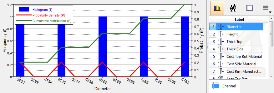
In the Distribution tab, view all input variable and output response data in a histogram or box plot. Switch switch between histogram and box plot view by clicking the ![]() (histogram) or
(histogram) or ![]() (box plot) buttons located above the Channel selector.
(box plot) buttons located above the Channel selector.
In Histogram view, the following data is displayed for all input variables and output responses:
The accuracy of the PDF and CDF curves depend on the number of bins selected.
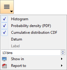
Histogram SettingsTurn the display of histograms, PDF curves, and CDF curves on/off, and modify the number of bins that display from the menu that appears when you click
|
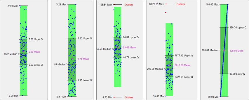
In Box Plot view, data is sorted and a box is drawn from the lower quartile (1st quartile, Q1, 25%) to the upper quartile (3rd quartile, Q3, 75%). Quartiles of a sorted data set consist of the three points (Q1, Q2 which is also the median, and Q3) that divide the data set into four groups, each group comprising a quarter of the data. The median and mean of the data are also marked in the box. In HyperStudy, this box is painted dark green (see images below). Box plots may also have lines extending vertically from the box to indicate the data outside the lower and upper quartiles. Furthermore, to identify outliers, these lines may extend only to the “whiskers” as opposed to the minimum and maximum of the data. Whisker location is calculated as a function of lower and upper quartile and the difference between them (this difference is known as interquartile range, IQR) as:
Any data that is not within the whiskers are identified as “outliers”. In HyperStudy, whiskers are displayed as a light green box instead of as a vertical line, and data points are indicated by blue dots. Horizontal scale is their run number and vertical scale is their value.
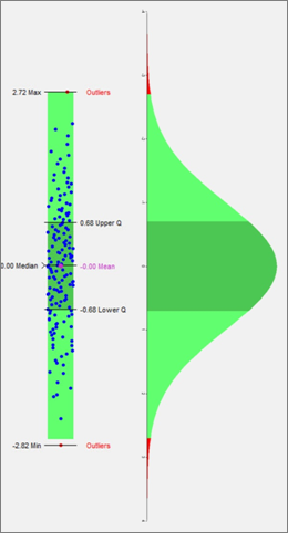
Box plots display the distribution of data. Use box plots to find the range, mean, median, quartiles, whiskers and outliers. This information tells you the spread and skewness of the data and helps you identify outliers. It is important that you understand the spread and skewness in order to understand and improve the variations in the data. Identifying the outliers gives you an opportunity to investigate these data points and resolve possible issues that you may have missed. The image below illustrates a comparison of a box plot of data sampled from a normal distribution to the theoretical probability distribution function of the normal distribution. The dark green color indicates the interquartile range, the Light green color indicates the range of the whiskers, and the red color indicates outliers.
|