In this tutorial, vectors and matrices will be created and then plotted. A few of the available commands to edit the plot will be used.
Step 1: Launch HyperMath.
| 1. | From the Start menu, select All Programs > Altair HyperWorks > HyperMath. |
This launches HyperMath in the HyperMath GUI. Notice that by default, a file named Untitled1.hml exists in the Editor window. By default, the Authoring Mode is displayed as well.
| 2. | Close the Library Manager and the File Browser. This allows for more room to review the plots as they are created. |
Step 2: Using the Editor Window, define a x vector and a y vector and create a line plot.
| 1. | In the Editor window, under the Untitled1.hml tab, enter the following line: |
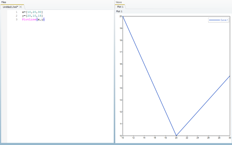
x=[10,20,30]
This defines the vector x as a base variable.
| 2. | Under the definition of x, add the following line: |
y=[20,10,15]
This defines the vector y as a base variable as well. Using the x and y vectors defined, a line plot will be created.
| 3. | For line 3, add the following command, which creates a line plot using the x and y vectors. |
PlotLine(x,y)
| 4. | Let’s execute these three commands to see the plot that is created. Click on the i icon,  , in the toolbar. , in the toolbar. |
The code up to this point and the resulting plot should look like the following:
| 5. | Save the file by going to File > Save As. Browse to the Desktop and save the file as Tutorial_2030.hml. |
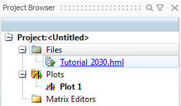
The tab in the Editor window now says Tutorial_2030.hml.
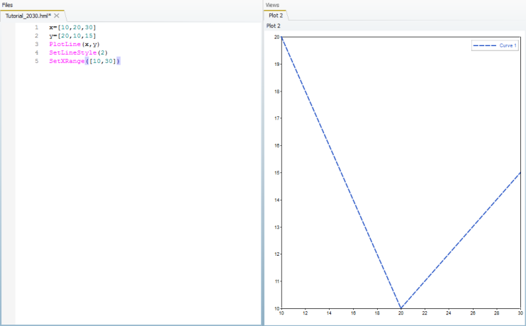
| 6. | Look in the Project Browser. In addition to Tutorial_2030.hml, there is also Plot 1 under the Plots folder. As we create more plots, additional plots will appear under the Plots folder. |
Step 3: Use additional commands with line plot to change the line style and x axis range.
| 1. | There are additional commands which can be used to change the defaults set in the plotting window. Add the following command to change the line style from a solid line (1) to either no line (0) or a dashed line (2). |
SetLineStyle(2)
| 2. | Next, the following command sets the range of the X axis to start at 10 and end at 30: |
SetXRange([10,30])
Notice how the values 10 and 30 are within square brackets. This is because the command SetXRange needs to have a two-element vector supplied, which tells it where the range should start and where it should end.
| 3. | Right-click on Plots in the Project Browser and select Delete All. This removes the plot which was previously created. |
| 4. | Click on the Run File icon, , from the toolbar. |
The line is now a dashed line and the x axis starts at 10 and ends at 30.
Step 4: Define two matrices to be used as x and y in the PlotLine command.
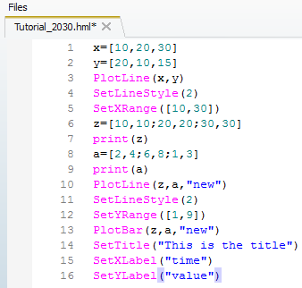
| 1. | To define a matrix, remember that the columns are separated by commas and that the rows are separated by semicolons. Below, the matrix z is defined. This matrix will be used as the x matrix later in the PlotLine command. |
z=[10,10;20,20;30,30]
| 2. | Next, use the print() command to print the value of the global variable z: |
print(z)
| 3. | Next, matrix a is created for the y entry in the PlotLine command is created. |
a=[2,4;6,8;1,3]
| 4. | Next, use the print() command to print the value of the global variable a: |
print(a)
| 5. | Right-click on Plots in the Project Browser and select Delete All. This removes the plot which was previously created. |
| 6. | Finally, evaluate the file by clicking on the Run File icon, , from the toolbar. The output from the script in the HMath window shows the matrix values: |
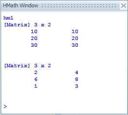
Remember, each column in the matrix corresponds to a line in the plot. Since there are two columns in both matrices, there will be two lines in the plot.
Step 5: Create a second plot using another PlotLine command.
| 1. | To create a line plot using matrices, the same PlotLine command is used as was used with vectors. In this example, the optional parameter "new" is used to indicate that a new plot should be created. |
PlotLine(z,a,"new")
| 2. | Click Run File, . This creates a second line plot on the current plot which is Plot 3. A new plot gets created, Plot 4, which contains the line plot for the matrices. |
| 3. | Under Plots in the Editor window, click the All Plots tab. This allows you to see both plots at one time. |
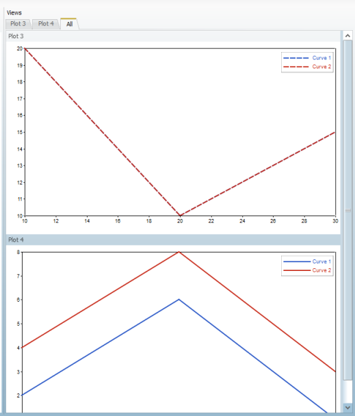
Notice how Plot 3 has two curves which are identical. This is because Curve 1 was previously created in Step 4. Then, because the optional parameter "new" wasn’t used in the PlotLine command, the current plot window was used to create Curve 2. Plot 4 was created because the parameter "new" was used in the PlotLine command.
Step 6: Use additional commands with line plots to change the line style and y axis range.
| 1. | The SetLineStyle command is used to change the line style of the line which was last created. In this example, curve 2 for the matrix line plot will be a dashed line: |
SetLineStyle(2)
| 2. | Next, the following command sets the range of the y axis to start at 1 and end at 9: |
SetYRange([1,9])
| 3. | Click Run File. This creates a third line plot on the current plot which is Plot 4. A new plot gets created, Plot 5, which contains the line plot for the matrices. |
| 4. | Under Plots in the Editor window, click the Plot 5 tab. In the upper right hand corner, click the Layout button,  . Select the following three window layout, . Select the following three window layout,  . . |
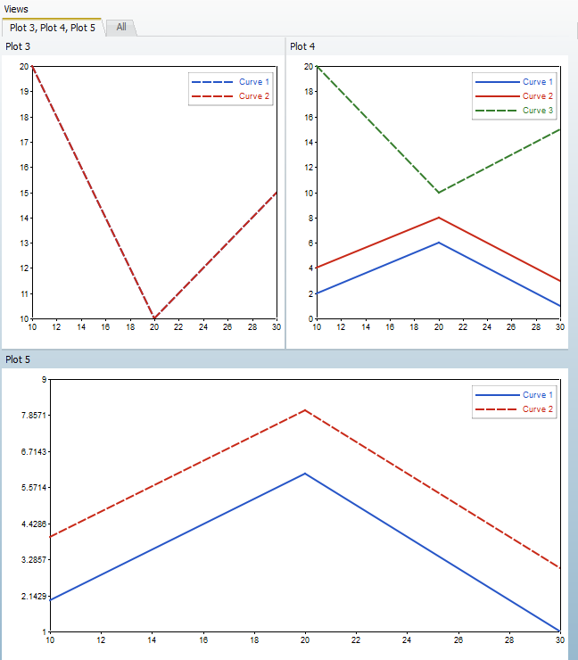
Notice how Plot 3 is unchanged, but Plot 4 now has curve 3. This is because Plot 4 was the active plot. Plot 5 was created because the "new" parameter was used. Notice how Curve 2 has a dashed line and the Y axis has a range of 1 to 9.
Step 7: Create a Bar Chart and add a plot title, x axis label, and y axis label.
| 1. | Right-click on Plots in the Project Browser and select Delete All. This removes the plots which were previously created. |
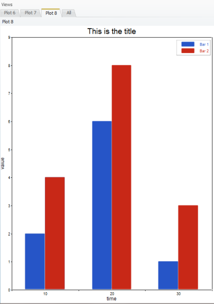
| 2. | A bar chart is created by using the PlotBar command. Add the following line to the script to create a new plot which is a bar chart. |
PlotBar(z,a,"new")
| 3. | A title can be added to the plot by using the command SetTitle. Below is the next line which should be added to the script. This line creates a title for the last plot. |
SetTitle("This is the title")
| 4. | The SetXLabel command accepts a string which is used as the label for the X Axis. Please add the following commands: |
SetXLabel("time")
| 5. | The SetYLabel command is just like the SetXLabel command, except it is used to create a label for the Y Axis. Please add the following command to your script. |
The final script will look like the following:
| 6. | Click Run File, . This creates a Plot 6, Plot 7, and Plot 8. Plot 8 is a bar chart. The plot has a title as well as a label for the x and y axis. |
See Also:
HMath-1000: Editing, Executing, Saving, and Plotting in HyperMath
HMath-1010: Working with HyperMath Authoring Mode
HMath-1020: Working with HyperMath Debugging Mode
HMath-2000: Working with HyperMath – Arithmetic and Relational Expressions and Control Structures
HMath-2010: Working with HyperMath – Logical and Relational Expressions and Control Structures
HMath-2020: Working with HyperMath – Functions and Matrix Operators
HMath-3000: Working with HyperMath – String Library
HMath-3010: Working with HyperMath – Input/Output Library
HMath-3020: Working with HyperMath – Input/Output Library Continued
HMath-3030: Working with HyperMath – Batch Mode
HMath-4000: Using HyperMath Functions for Curve Fitting
HMath-4001: Using HyperMath for Material Characterization
HMath-4010: Solving Ordinary Differential Equations
HMath-4020: Solving Differential Algebraic Equations
HMath-4030: Optimization Algorithms in HyperMath
HMath-5000: Using HyperMath in HyperView Results Math
HMath-5001: Post Processing Results from FEA
HMath-5002: Registering a Function in HyperGraph 2D
HMath-5003: HyperMesh-HyperMath Cross Execution of a Tcl Script
HMath-5004: HyperMesh-HyperMath Cross-debugging of a Tcl Script


